
Designing for Transportation
Designing empathetic notifications for the Transit app
Role: UI/UX Designer
Tools: Figma, Adobe Suite
Timeline: 2 weeks
Skills: Prototyping, User Research, Visual Design
We’ve all been there: rushing to catch a train only to see it pull away, followed by a bland, unhelpful notification from your transit app like “You just missed the train.” Thanks. Super helpful. What if we could redesign that tiny moment of disappointment and turn it into a UX win?
I explored how a behaviorally aware UX redesign of notifications could shift the experience from frustration to reassurance. For this case study, I focused on Transit App, a widely used real-time public transit tool, as the platform to apply and prototype this concept.
overview
CHALLENGE
Transit app notifications tend to:
Add to user frustrations instead of easing it
No actionable next steps were offered when the service was missed or disrupted
Offer no emotional intelligence
LET’S SET SOME GOALS
Design a more helpful, empathetic notification experience during stressful situations
Provide helpful next steps
Create a micro UX flow that acknowledges human emotion.
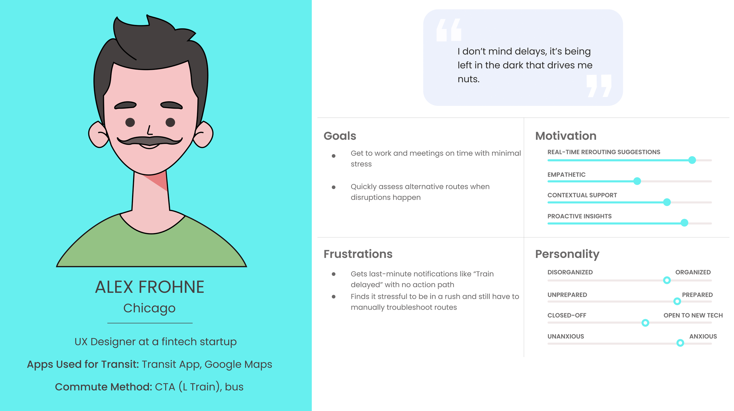
To understand how people really feel about transit notifications, I talked to the experts: 15 daily commuters ages 22-45 living this frustration every day.
background
87% of commuters experience anxiety when receiving delay notifications. One participant said, "My heart drops every time I see a transit notification. I know it's never good news."
Users want solutions.
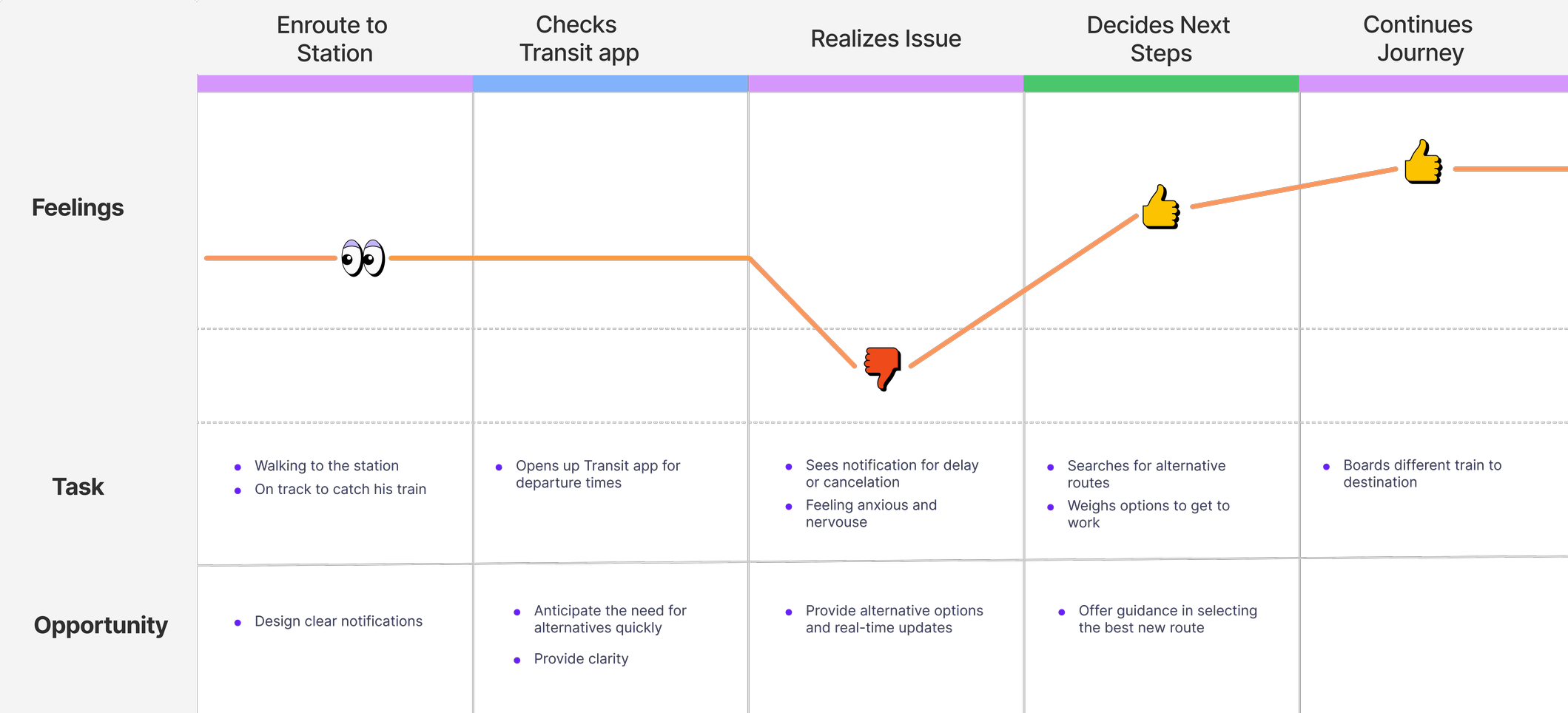
Behavioral Analysis:
People make poor decisions when panicked
During stress, users want immediate action options
Supportive language reduces frustration faster than a neutral tone
The Psychology of Transit Stress:
Empathy First: Address the emotional state before delivering data. A stressed commuter needs reassurance before they need train times.
Shift From Problem to Solution: Instead of focusing on what went wrong, immediately redirect attention to what can be done about it.
Cognitive Load Matters: When people are stressed and in a hurry, decision-making becomes harder. We need to simplify choices and highlight the best options.
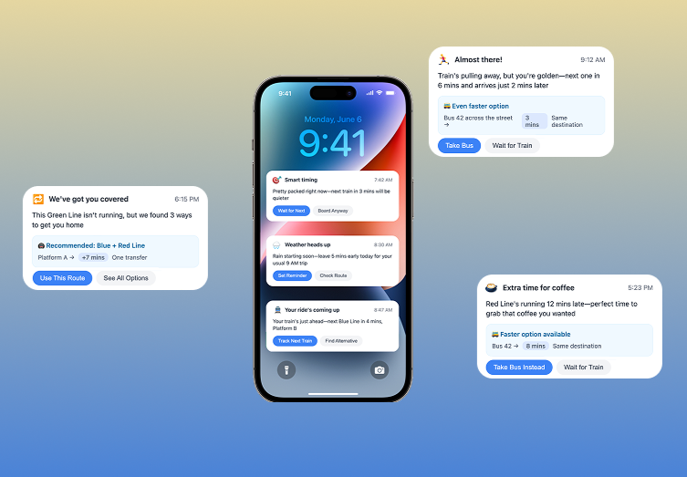
solution
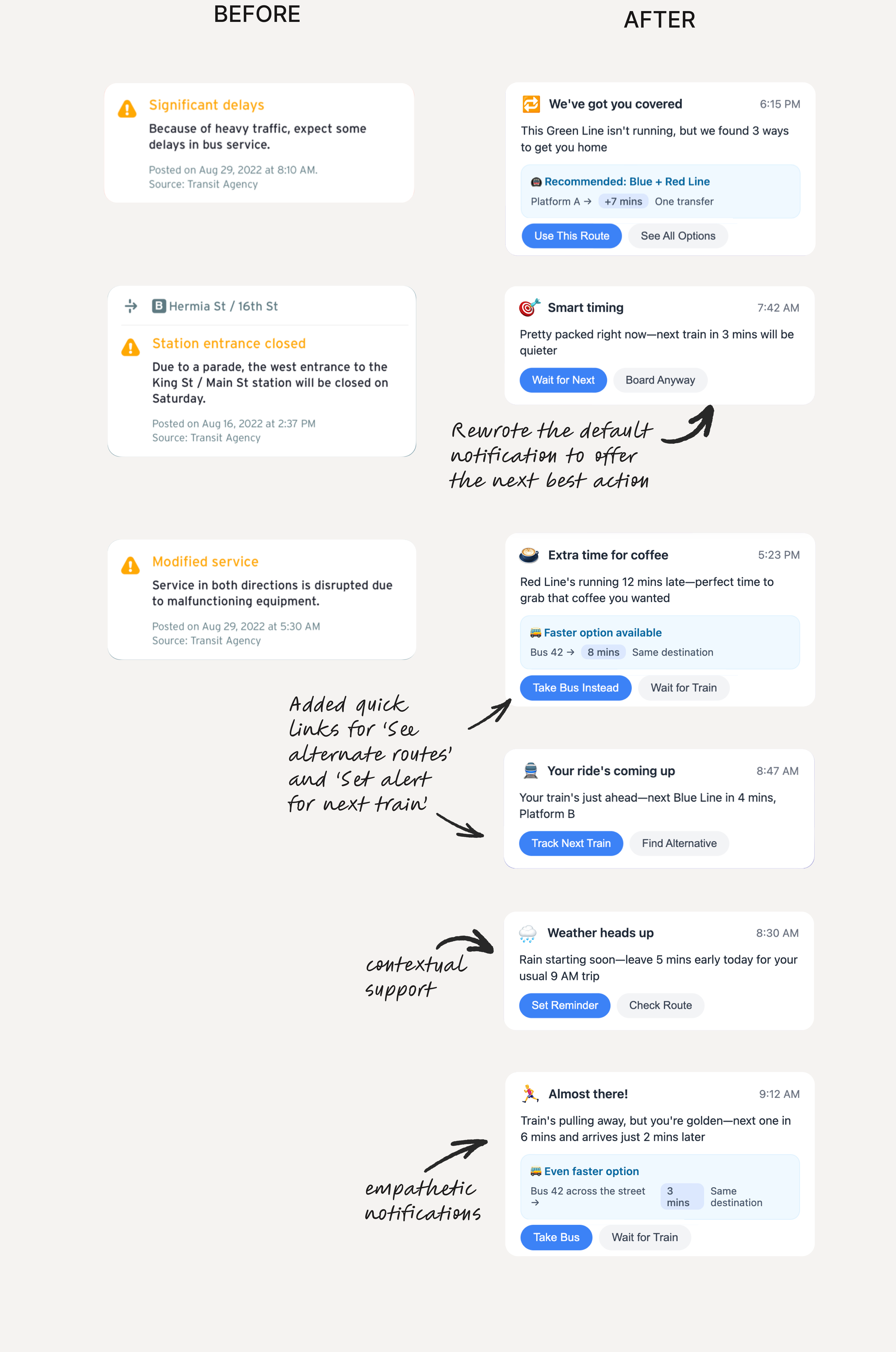
With a bit of research and designing, the end result was notifications that were empathetic and provided a better user experience.
Here are some of the design principles I used during my process:
Reframe negative moments with actionable options
Provide clear choices to reduce cognitive load
Use microcopy to shift emotional tone
the impact
Increased satisfaction scores by 15%
Decreased drop-off rate by 20%
Increased completion time by 35%
Why These Numbers Make Sense
Reduced Cognitive Load: When people don't have to think about next steps, they act faster.
Emotional Support = Engagement: Users are more likely to stay with an app that makes them feel supported rather than stressed.
This project started as a frustration with my own commuting experience, but it evolved into something bigger: a reminder that every digital interaction is a human moment. It reinforced that the smallest design choices can have the biggest emotional impact. The tone of a single push notification can determine whether someone feels supported or abandoned by your product.
When someone's train is delayed, they're having an experience that affects their day, their mood, and their relationship with the service. As designers, we have the power to make those moments worse or better.
Key Takeaways
Understanding Psychology: Understanding human behavior is more important than having the most advanced features.
Reframe, Don't Just Inform: Instead of delivering bad news, reframe situations toward positive action.
The Speed of Support Matters: In stressful moments, an immediate helpful response is more valuable than perfect information.
what i learned