
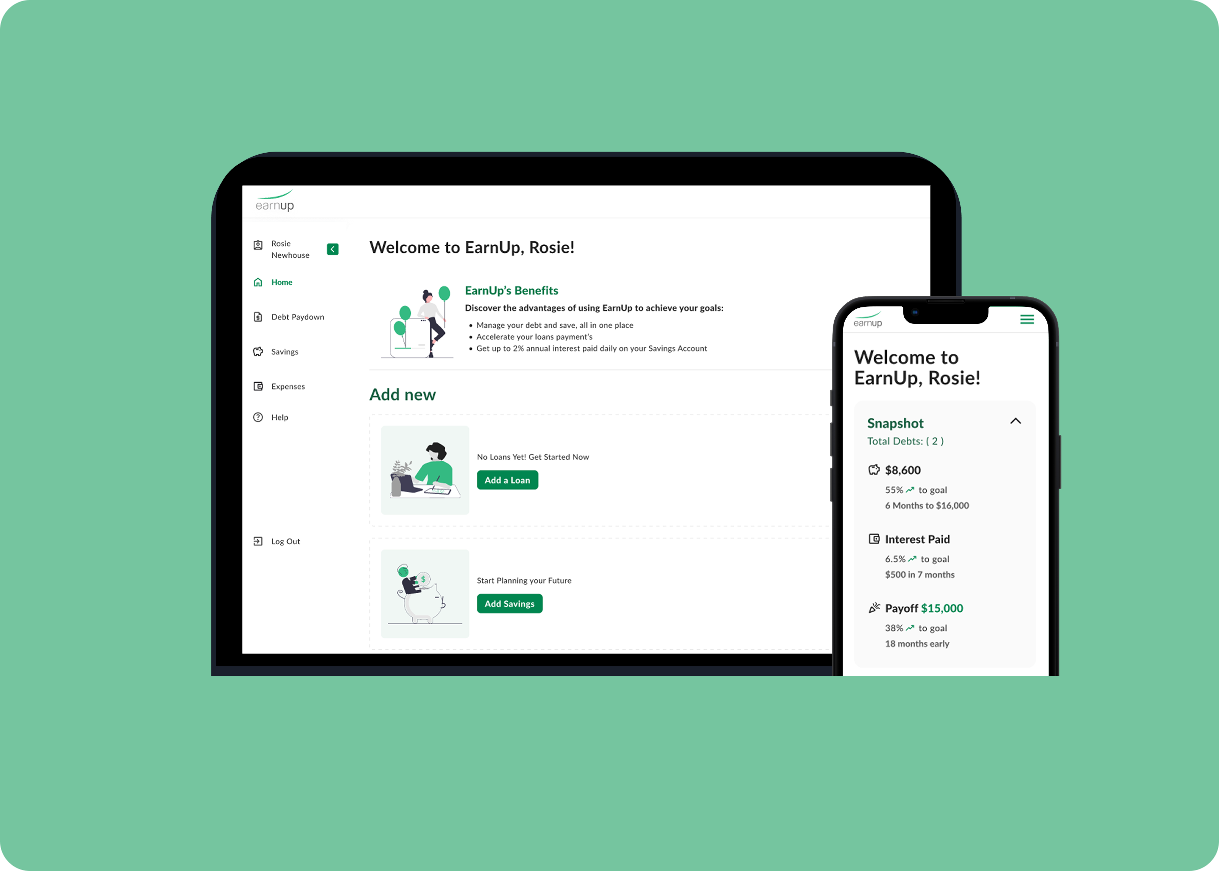
EarnUp
Redesigning the enrollment flow for a fintech startup helping users manage and pay off debt
Role: UI/UX Designer
Tools: Figma, Miro
Timeline: June 2023 - August 2023
Team: Emily Wasserman (product manager) & Isabela Chinellato
overview
Over the summer of 2023 I was an UX Design intern at EarnUp, a fintech platform helping users manage debt and improve financial wellness. I was tasked to come up with solution to the 75% drop-off at the very first step of the enrollment process. I worked with the UX team to redesign the enrollment experience to make it feel simple, safe, and worthwhile. Through research and testing, I reworked the sign-up flow to give users a reason to stick around.
CHALLENGE
While users were motivated enough to visit the signup page, 75% were abandoning the process before completing the first step due to overwhelming data collection up front and a lack of a clear value proposition. This represented a significant loss in potential customers and revenue.
LET’S SET SOME GOALS
Create a frictionless, user-friendly enrollment process that feels approachable, not intimidating
Build trust before requesting sensitive information through transparency and education
Reinforce EarnUp's mission and benefits upfront so users understand the "why" before the "what"
Before designing anything, I needed to understand the humans behind the loans and debt. Through interviews, surveys, and usability tests, I pieced together the emotional and functional pain-points users face when enrolling in EarnUp.
research
From 5 interviews over Google Meet:
Users felt intimidated by the amount of personal and financial data required upfront
There was a lack of clear value proposition reinforcement during signup
From usability tests on the existing website:
Users couldn't see progress or end goal
There were too many form fields, which created decision paralysis
From 15 user surveys:
Users hesitated to provide sensitive financial information without understanding the full benefits
There was no clear security messaging or credentials displayed
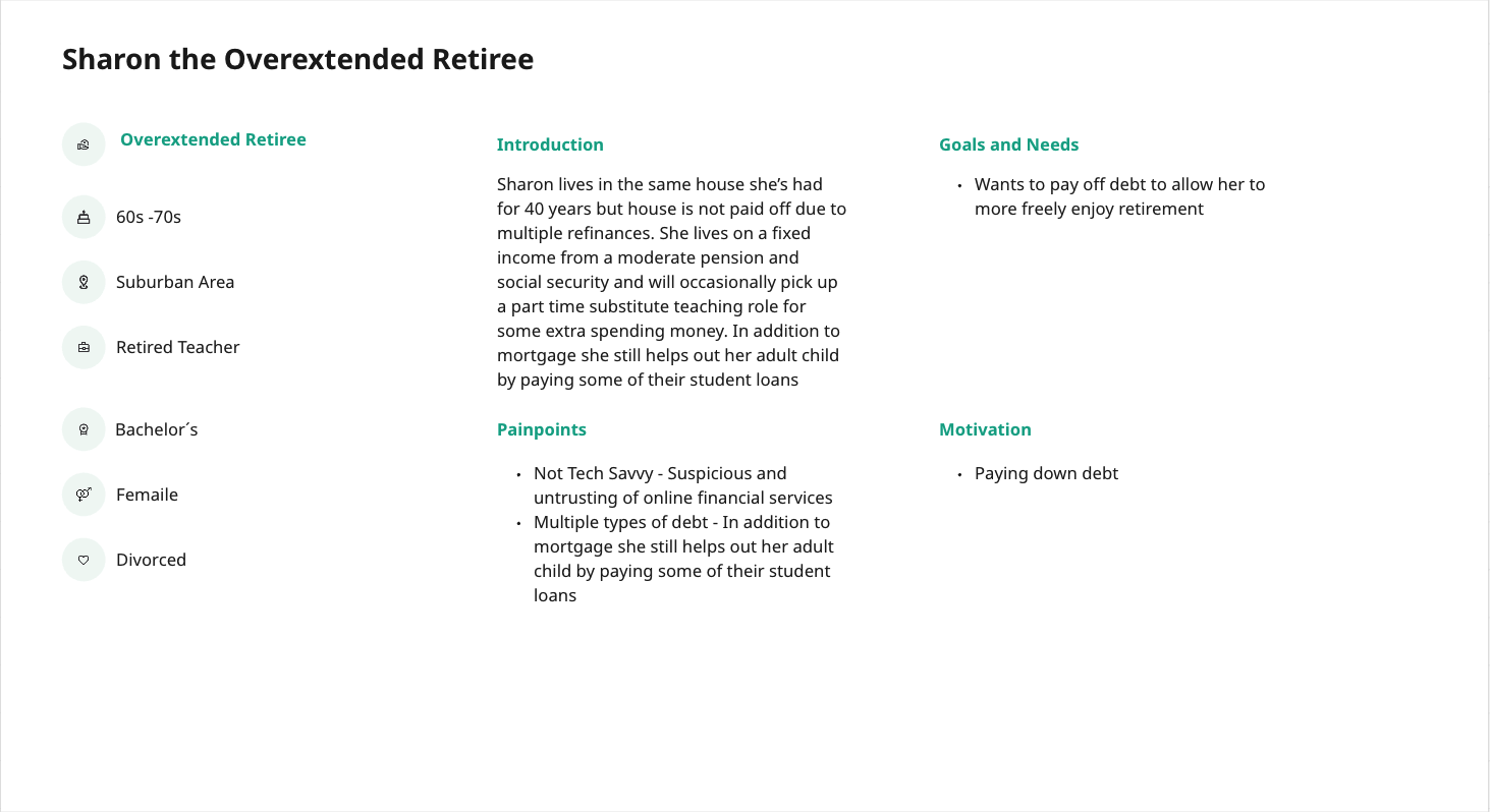
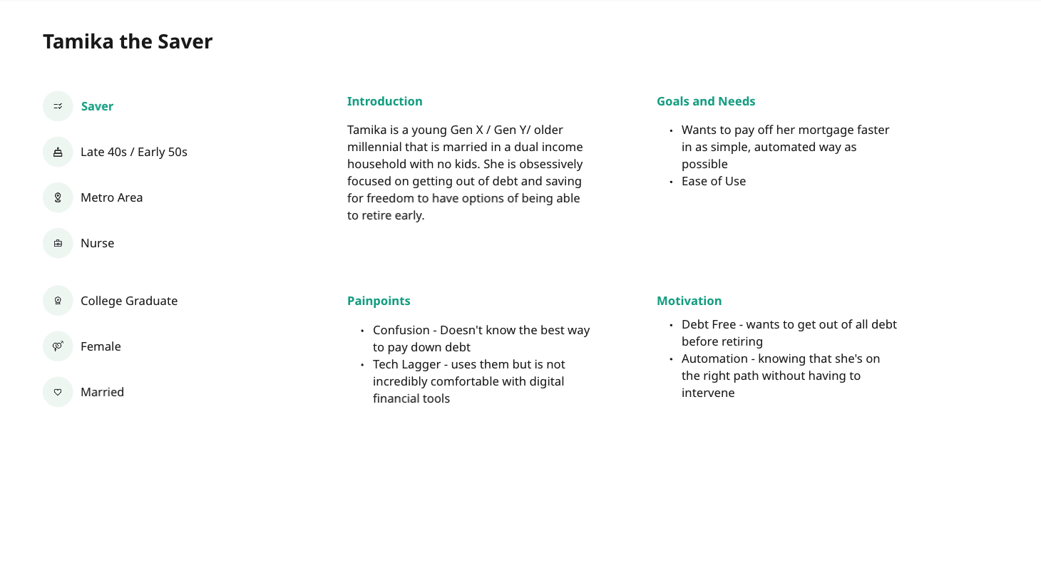
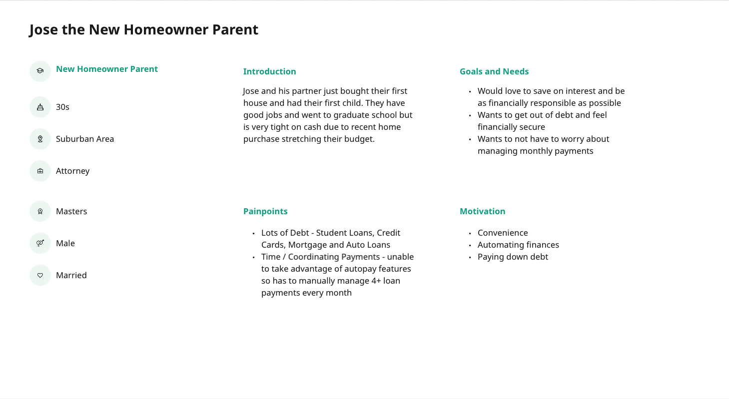
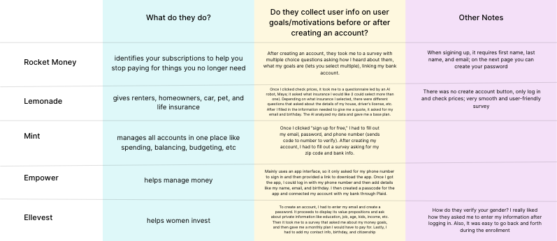
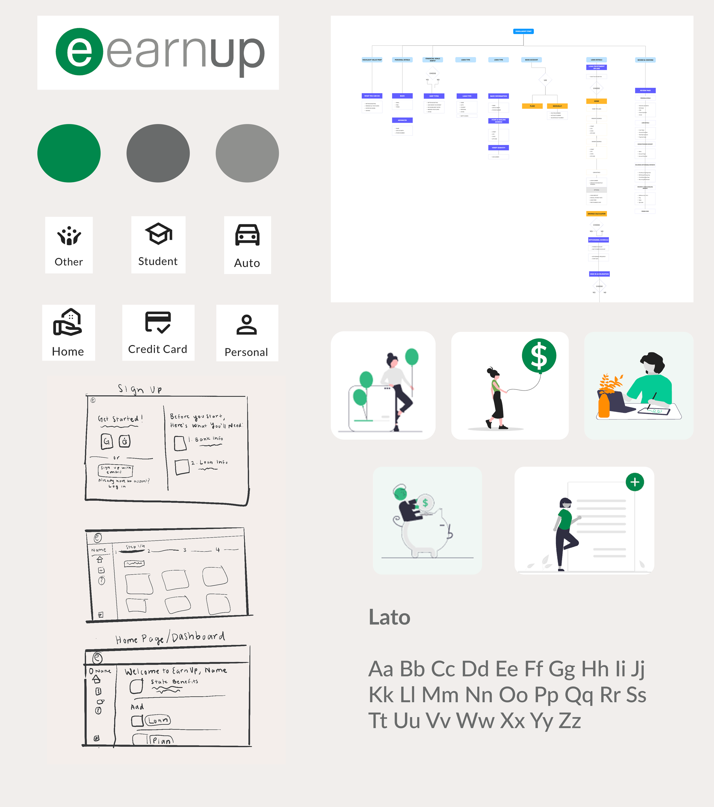
Using the pain points I gathered from my interviews, surveys, and usability tests, I created personas to represent some of our users and their goals, frustrations, and decision-making styles. To put our experience in context, I also conducted a competitive analysis of similar fintech companies, breaking down how they structure their enrollment flows to reduce friction. This gave me a clear picture of what not to do, as well as a few smart ideas worth adapting.
solution
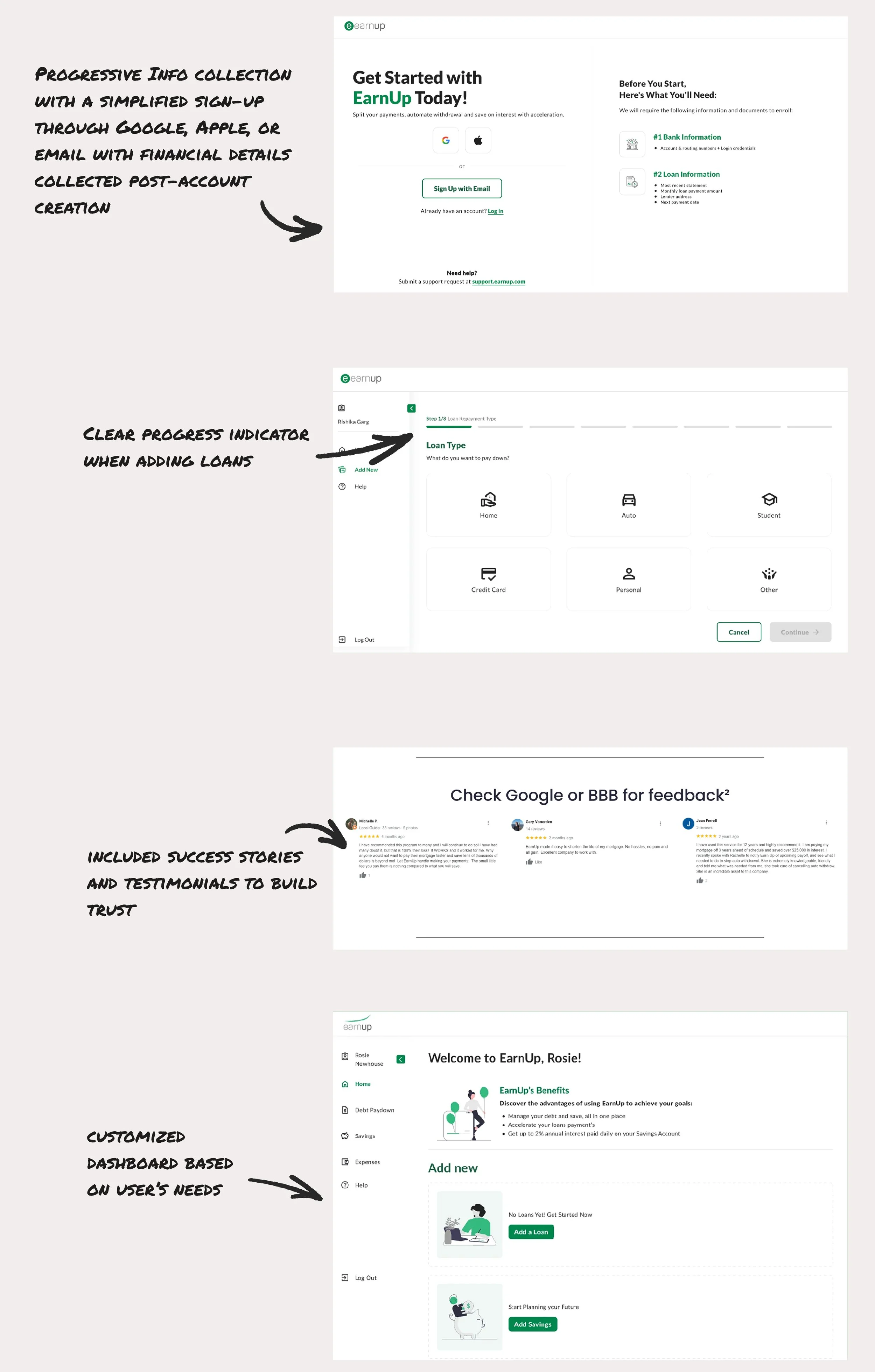
Instead of asking for everything up front, we created a journey that builds trust progressively while demonstrating value at each step.
Here are some of the design principles I used during my process:
Reduce Friction: Ask only for what’s necessary, when it matters most
Guide with Empathy: Design with the user’s pain points and motivations in mind
Build Trust: Use friendly language and clear value propositions
behind the solution
the impact
Decreased drop-off rate by 20%
Increased completion time by 35%
Increased satisfaction scores by 15%
This project taught me that the most impactful design changes are about simplification and creating flows that feel intuitive. While EarnUp needed comprehensive user information for their service to work, the key was finding the right moment to ask for it. By focusing on building trust first and collecting information progressively, I created a more human-centered experience that ultimately served both users and business goals.
Working on EarnUp's enrollment flow reminded me why I'm passionate about design. I truly enjoyed figuring out solutions to remove barriers that prevented people from getting the financial help they needed. Every percentage point improvement in our drop-off rate represented real people who could now access tools to manage their debt and improve their financial future. That's the kind of impact that makes late nights and endless iterations worth it.
what i learned